Butte College • 2 min read
Search for Classes
A mobile redesign with no rebuild budget: 400% more mobile class searches and 88% fewer support tickets.
400%
More mobile class searches
Increase in students searching for classes on mobile devices
88%
Fewer support tickets
For the Search for Classes tool
17.2%
Lower bounce rate
On the Search for Classes tool
- Role
- Webmaster: UX design and front-end development
- Timeline
- Designed fall 2019, launched spring 2020
- Team
- Department of one, working across departments
- Constraint
- No budget to rebuild the tool
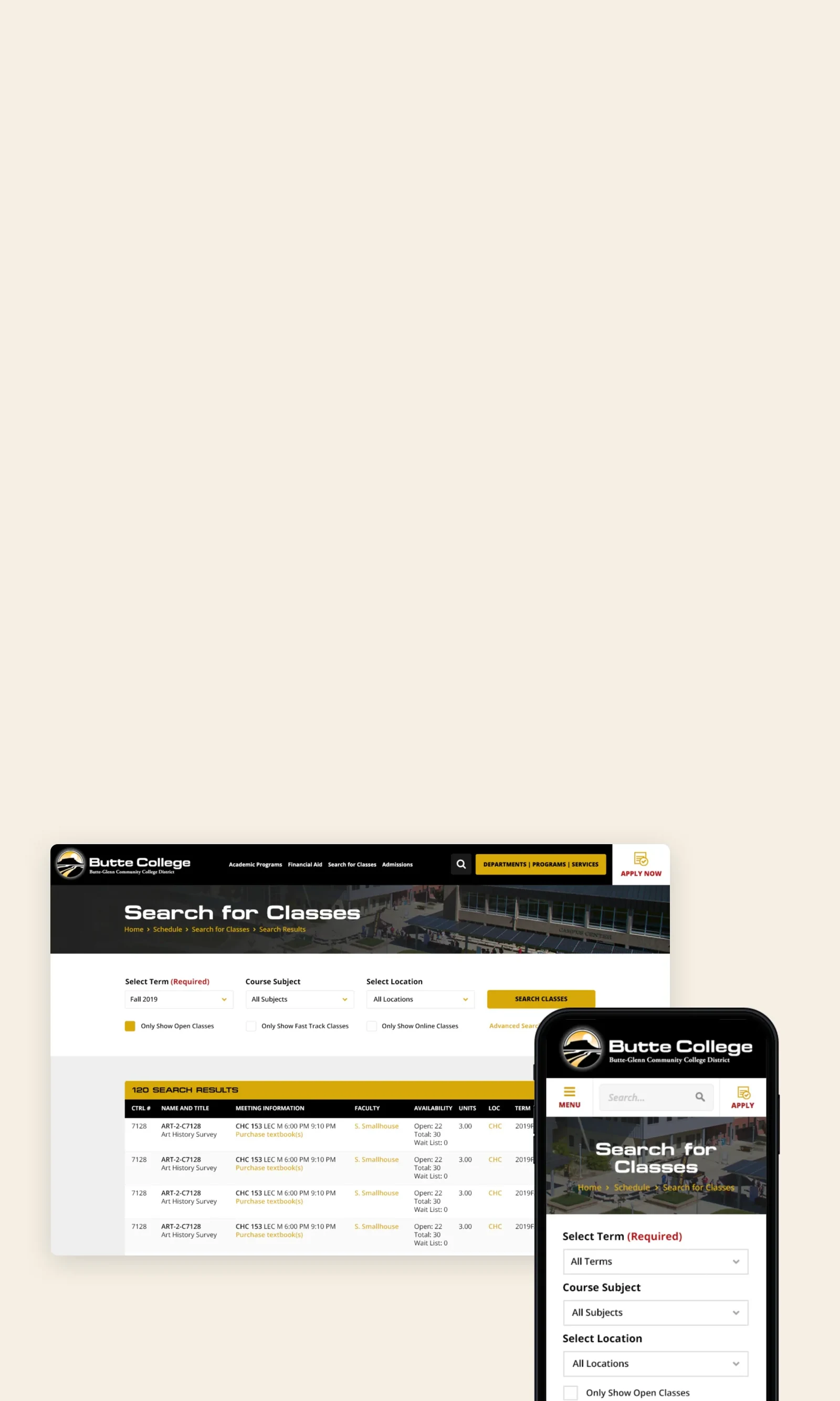
In 2019, more than half of Butte College’s web visitors were on mobile, but fewer than one in ten class searches happened there. As the college’s new webmaster, I spotted the gap in our analytics and took it on without being asked, with under two months until registration.
Challenge
A desktop-only tool
- The form and results weren’t built for small screens
- Building locations lived in a separate table, not the results
- Changing a filter meant starting over from the form
Solution
A mobile-first redesign, not a rebuild
- The three filters students use most come first
- Meeting times, locations, and open seats appear in the results
- Built in CSS and targeted JavaScript on the existing application
Restyle it, don’t rebuild it
With no budget to rebuild, I redesigned what I could change myself.
Mostly that meant CSS, minimal markup changes, and some targeted JavaScript on top of the existing application. The UI kit I had built for the college earlier let me go from paper sketches straight to high-fidelity mockups. Rapid prototypes went to stakeholders, then a coded version to moderated testing with students in a lab, with two rounds of changes before launch.
The essentials first, everything else one tap away
Results
It launched in spring 2020, before registration and without a redevelopment budget. Class search started working where students actually were.
What I learned
- It was one of my first chances to bring several departments together and take a project from concept to launch.
- I had mostly worked at startups and design agencies, so the bureaucracy was new to me. It prepared me well for running projects at SNHU.