Institute of Management Accountants • 7 min read
myIMA
Consolidating 40+ pages into one member portal for 120,000+ members, used by tens of thousands every month.
40+
Pages consolidated
Six menus of pages became five areas
120k+
Members
Launched to every member in August 2026
3
Sites on one design system
Ledger is shared across imaglobal.org, imatoday.org, plus myIMA
- Role
- Principal UX Designer & Architect
- Timeline
- Oct 2025 – Aug 2026 launch
- Team
- Me, a senior back-end developer, plus a UX architect for research
- Stack
- Next.js, TypeScript, Tailwind
The old myIMA was 40+ pages spread across six navigation menus, and members had to know where to look. I ran its replacement from start to finish on a bootstrapped team, from internal research to launching it to all 120,000+ members in August 2026.
Challenge
Navigation instead of answers
- 40+ separate pages across six navigation menus
- Membership, learning, credential, and community data in separate systems
- Support staff needed a safe way to see what a member sees
Solution
One dashboard that shows active work
- Five areas, with the dashboard surfacing what needs attention
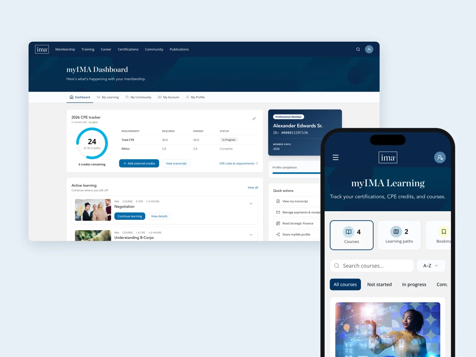
- A CPE tracker that shows progress, ethics credits, and carryover
- Help docs, plus a read-only support view for staff
What members and staff needed
In late October 2025, I ran four SME sessions with another UX architect, covering technology, corporate partnerships, member experience, and academic partnerships. Several of those experts are accountants who are IMA members themselves. We built on member interviews other staff had done, plus direct feedback from contact forms, emails, and support tickets. I also combed through our member discussion forums, even the CMA subreddit. We added an audit of every page in the old portal, plus a review of other professional associations. I synthesized it all into six themes, five personas, and a journey map for each persona.
What we heard
- Members and volunteers jumped between four separate platforms
- Invisible deadlines caused a yearly rush: the December 31 CPE deadline drove a support spike every November and December
- Missing data meant extra manual work for staff
- Members couldn’t see what their membership included
- Members often couldn’t find their member ID
I don’t need bells and whistles. Just show me my CPE status, let me take the course, and give me the certificate. That’s it.
40+ pages became five areas
One dashboard that surfaces active work replaced 40+ pages of navigation.
I audited every page of the old portal and sorted each one by the job it served: account, profile, learning, community, or purchases. Redundant pages were cut. Misfits like awards and nominations were flagged as workflows of their own. The goal was to handle most tasks from the dashboard. The CPE tracker went to the top: progress, ethics credits, carryover credits, and whether a member is on pace for the December 31 deadline.
I took early prototypes back to the departments from the research sessions for a final round of feedback. There wasn’t much: mostly requests like adding exam guides for members working toward certification, plus questions about how features would work. The design moved ahead mostly as shown.
Front end first, back end in parallel
I built the entire front end, then most of the remaining back end.
With a small team, I leaned heavily on AI-assisted development to keep pace. The front end runs on Ledger, the design system I’ve built up at IMA. The data comes from several back-office systems, so I built against a typed data contract with realistic mock data, then switched each area to live data as it came online.
One change from wireframe feedback became a favorite. Members often struggled to find their member ID. Early wires showed a member card only on the dashboard, on the left. It moved to the right column as a secondary card, on every screen. People said it looks like a real ID card from their wallet.
How the build kept moving
- A typed data contract with mock data, so design and build never waited on the back end
- One monorepo, where each app builds its components from Ledger, keeping every site in sync
- I managed the project too: standups, Workday tickets, plus a tracker of 75+ integration items for contractors outside our ticket system
- When our back-end developer retired, I took over most of the remaining C#, reviewed by Engineering
- Unit, component, and end-to-end tests, with automated accessibility checks
The Learning tab keeps a learning streak. It moves through tiers, from Getting started to Rare company at 100 days, each with its own color, icon, plus label. By design, nothing counts down or warns that a streak is about to end. After a break, it simply starts again at Getting started.
My Profile replaced the old CMA directory with a public profile, a bit like LinkedIn. Members choose what’s public, field by field. Unlike other platforms, members can’t just claim a credential or a skill: profiles only show credentials verified through Credly, plus skills and competencies from IMA courses they’ve taken. Each member gets a custom link to share, which also gives IMA a place to promote events or courses to the people who visit. Members can also pick one of six banner colors, including one for each main certification.
A coordinated launch, with support built in
Read-only on purpose, so support escalates the real issue instead of patching the account.
myIMA launched alongside IMA’s new website, as part of a larger coordinated launch. I coordinated teams across IMA to set up test accounts, managed bugs through the launch, plus wrote the online help docs for Member Services.
Member data was moving to a new system at the same time, so support needed to see each account exactly as the member did. I designed a read-only support view for Member Services. An orange frame plus a read-only bar stay on screen the whole time, so staff always know where they are. Nothing can be changed from this view, so staff can’t make a problem worse. Support escalates each issue to the data team or engineering, based on what went wrong.
We also built an error code system. When something fails, members see a short code instead of sensitive details. Support looks it up to know exactly who to escalate the issue to.
Outcomes
It’s early, but two months after launch, tens of thousands of members already use myIMA every month, and support tickets are down.
The project also led to new processes between design and engineering, which now support its continuous development. We’ve already shipped one change from member feedback: certification requirements are now tracked step by step in the Learning tab. These are the measures we set in the research to track it as it matures.
What we set out to measure
- Fewer “where do I find X?” support tickets
- Monthly use of the CPE tracker
- Profile completion
- Common tasks done from the dashboard
What I learned
A design system has to fit the team that maintains it. IMA’s has gone through three versions. The first, for our B2B site, was lean, and that site launched in just four months. For the new marketing site, we built on a purchased system, but it covered more than we needed, which made it harder to maintain. Ledger, the third, keeps the best of both, simplified, with new design work. It’s shared across all three IMA sites, and myIMA runs almost entirely on it.
Team and timeline
Timeline
October 2025
Research and synthesis begin (about two months)
Early 2026
IA, wireframes, and prototypes (about two months)
Spring–summer 2026
Front-end development and testing
August 2026
Launch to all 120,000+ members
August 2026
Promoted to Senior Manager, User Experience after the launch
Since launch
Continuous development
Team
I designed and built the front end. A senior back-end developer built the services with me until retiring with a few months left. From there, I wrote most of the remaining C# myself with help from AI, then my counterpart, the Senior Manager of Engineering, reviewed it. Another UX architect joined me for the initial research.